RAPID PROTOTYPING REDESIGN

PROJECT DESCRIPTION
This project explores the skill of rapid prototyping to simulate a quick client deadline. The task was to choose an existing streaming platform and conduct user testing to analyze frustrations with the interface.
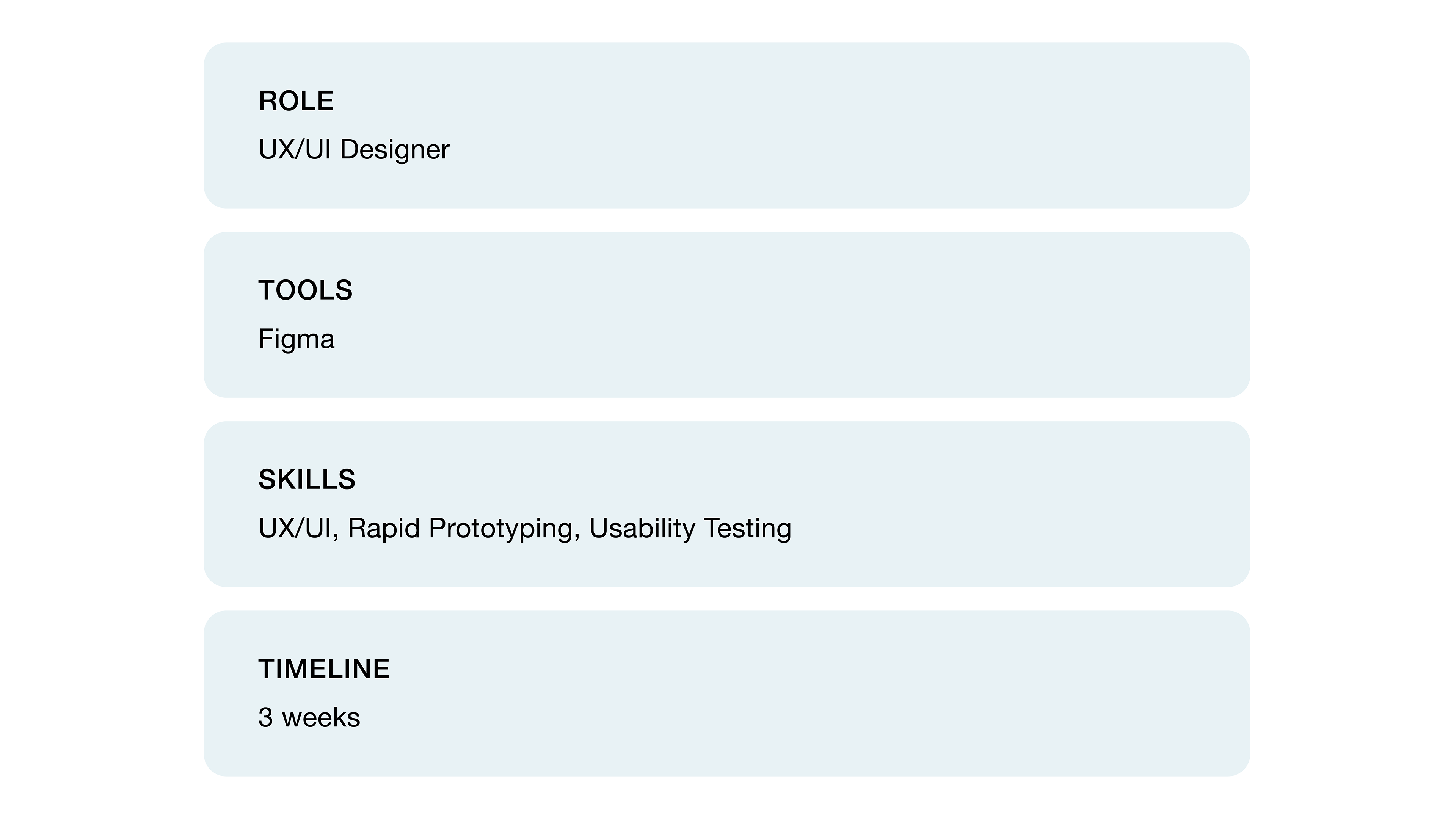
USER RESEARCH
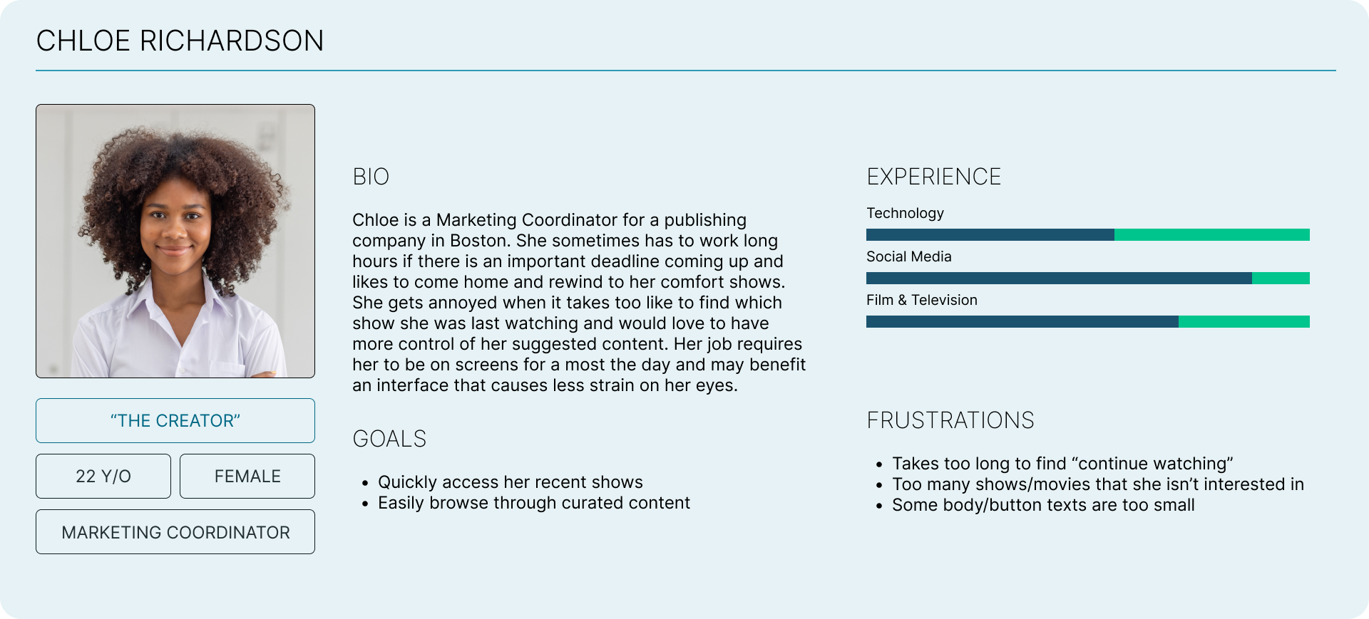
User research conducted on 7 individuals aged 20-25
USER PERSONAS

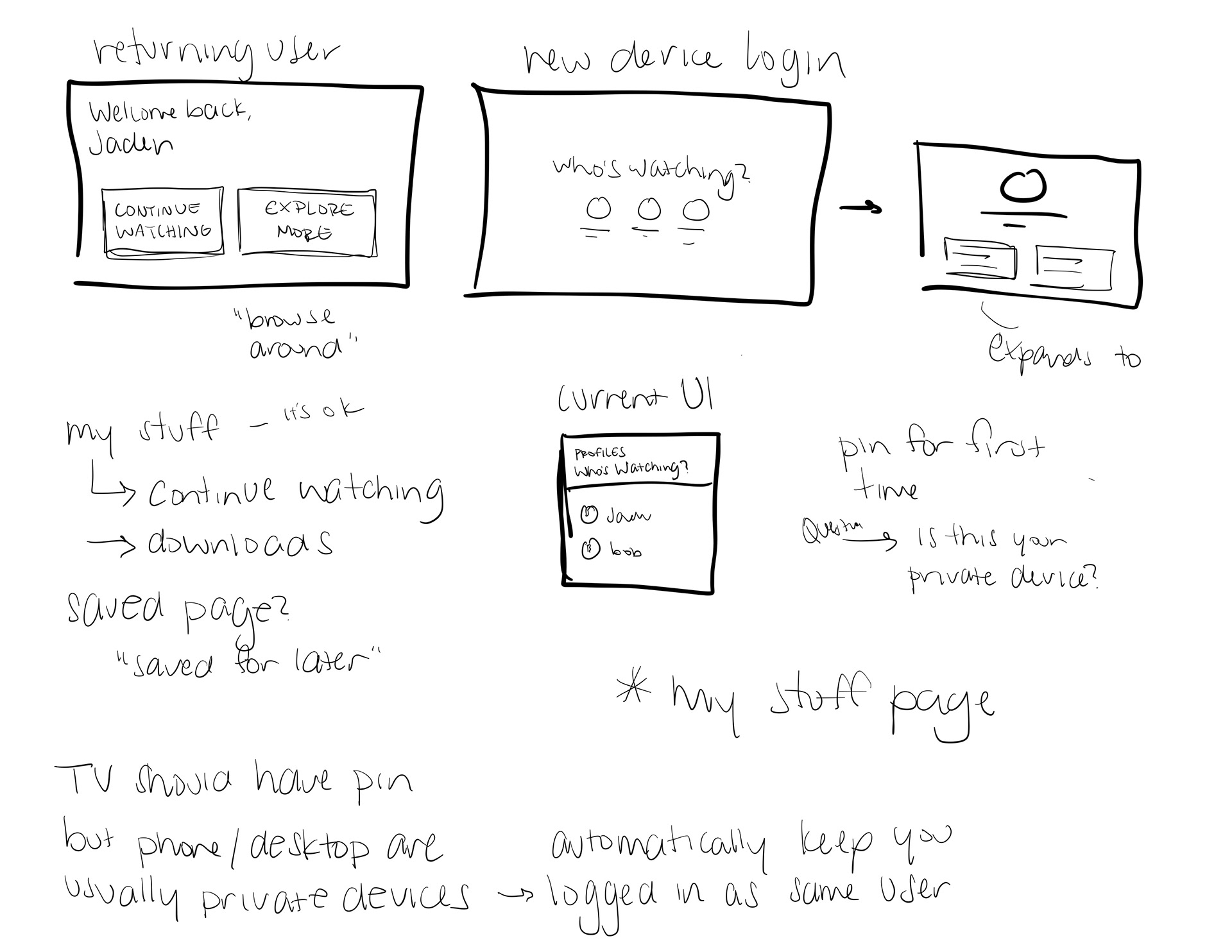
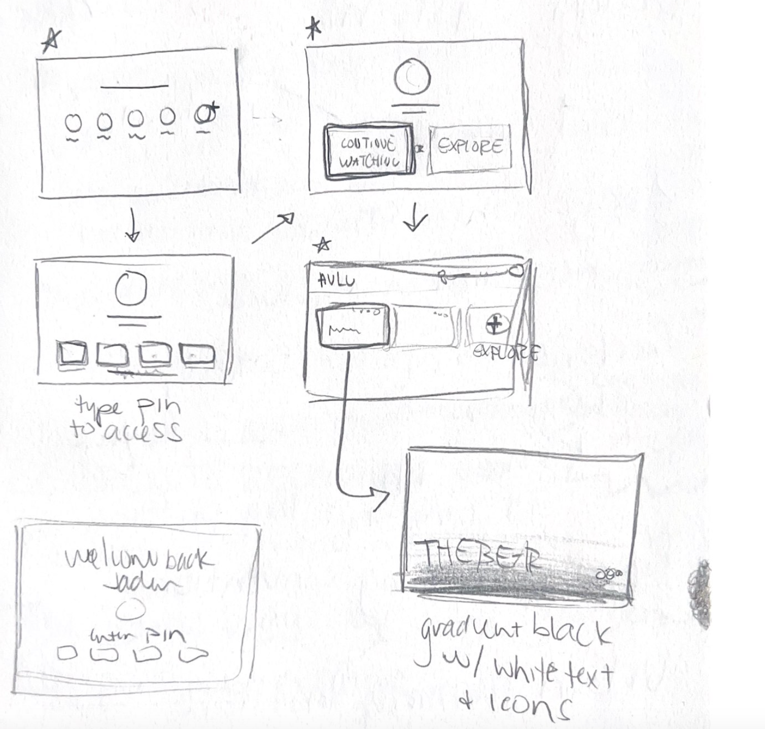
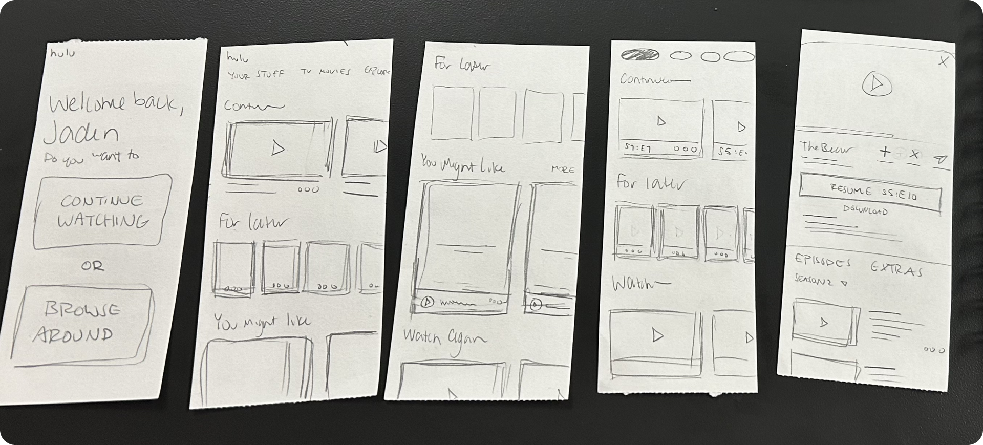
SKETCHES
PROTOTYPE TESTING
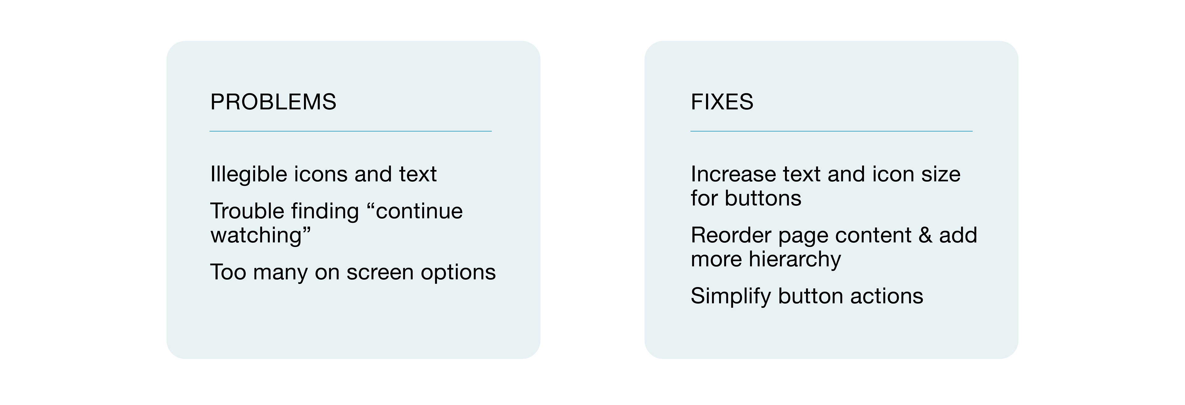
RESULTS
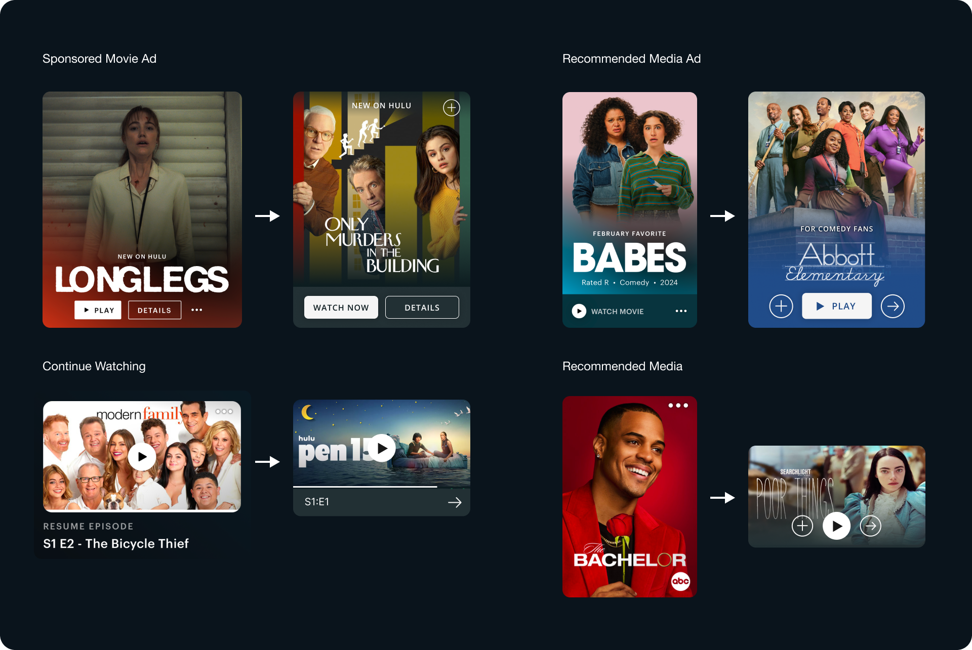
BEFORE
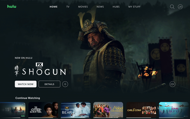
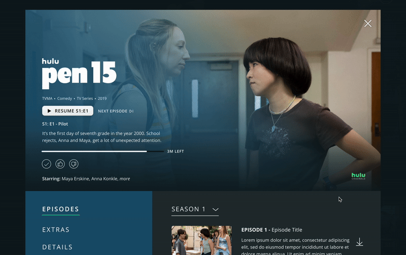
AFTER
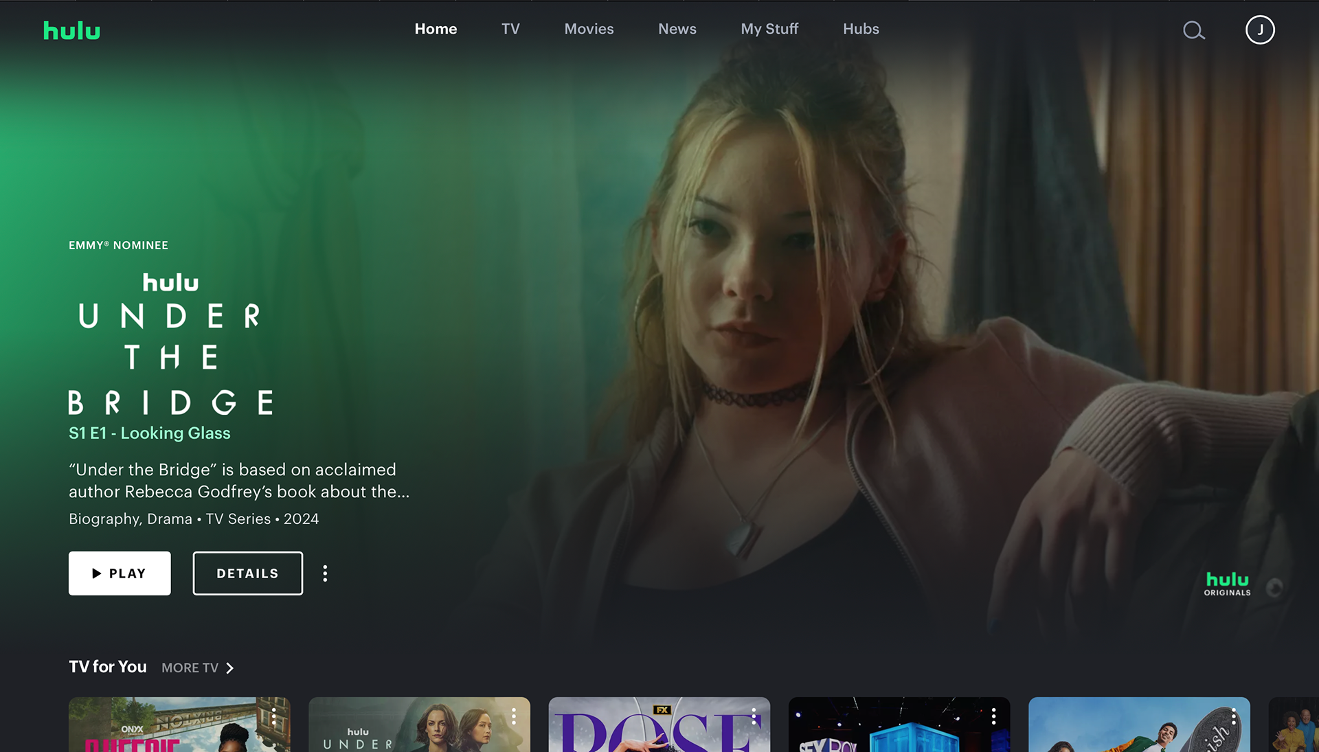
Menu icon on cover images added another user task
Continue watching section farther down the page
No play button signifier on cover images
Problems with legibility for text and icons
Replaced menu icon with “add to list”
Continue watching is the first section option
Added overlay buttons to avoid clicking on menu first
Increased text and icon sizes
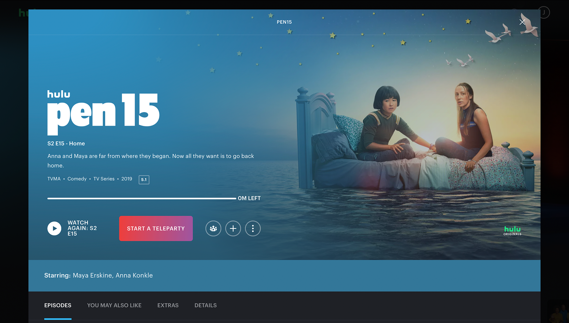
Play button is secondary
Teleparty and watch party icon doing the same task
Episodes layout is very crowded
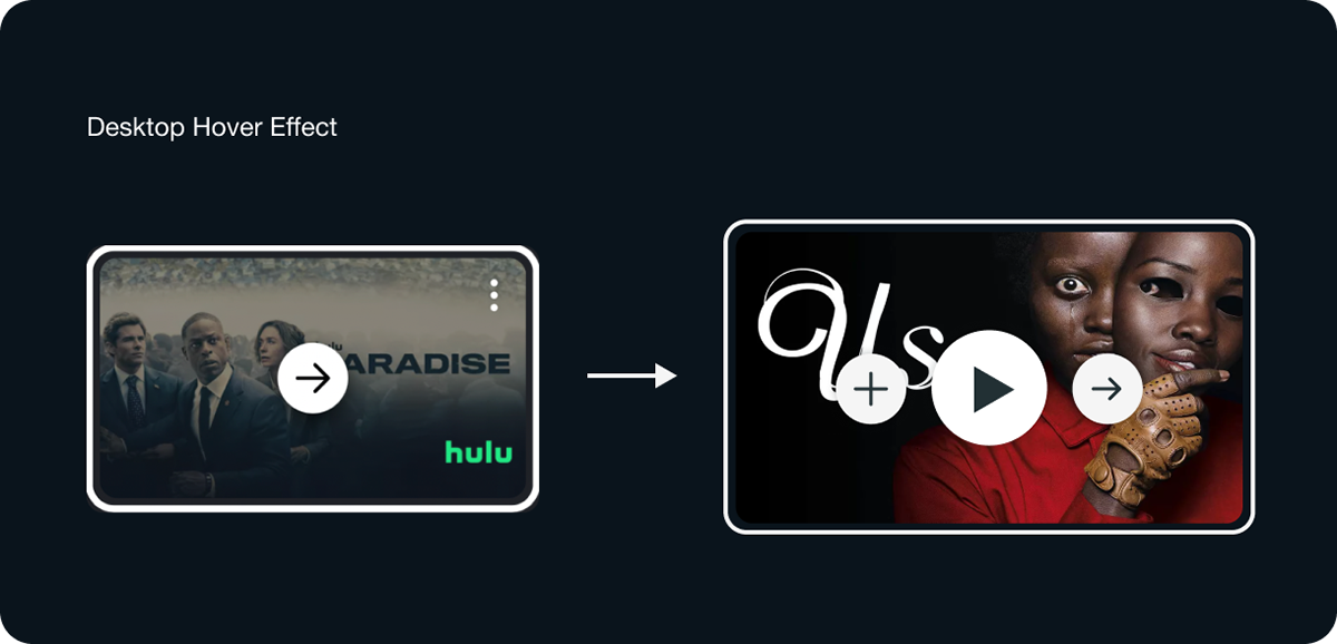
Exit icon loses visibility in the top corner
Play button has a better CTA
Added “like” and “dislike” buttons to remove extra click
Changed layout of episode list to allow for more space
Increased size of exit icon and added a drop shadow
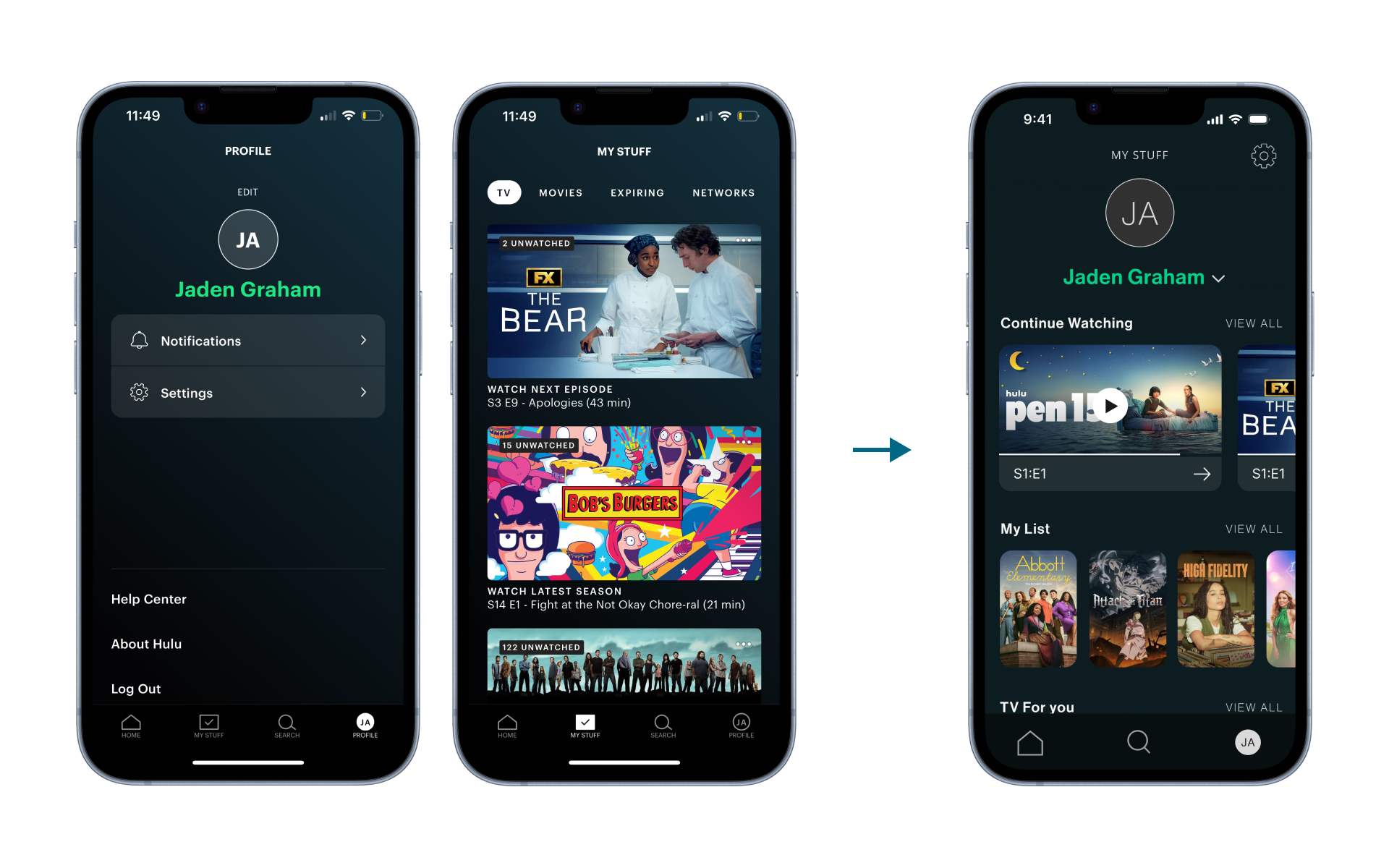
I combined "My Stuff" and "Profile" into one page for more efficiency in terms of navigation and visibility. There was minimal space being used on the profile page and too much being used on the "My Stuff" page. The user would now be able to go to one central location to see their list, recent watches, and account information.
CARD DESIGN (Before & After)